Monday, December 7, 2009

Well...How Did I Get Here?

While I already spoke a bit about my blog's visual evolution in this post, I'd like to take some time to reflect on my overall development as a "blogger." When I first created this blog, I was a bit hesitant and unsure about blogging as a whole-- it seemed to me a little more informal than the writing I had been used to doing. However, I soon found that it was possible to maintain a formality and seriousness to blog postings, while still having room for lightness and individual personality. As a blogger, I've tried to find the right balance between these two extremes.

My main concern has been to make sure that my writing sounds professional but is also thought-provoking and interesting. Rather than just summarizing and regurgitating information, I've tried to explore engaging concepts and make original observations. As I've gradually become more comfortable with the entire process, I think my blogs have become more engrossing and memorable. I feel that I am on my way to settling into my own blogging "voice," though as always there is room for improvement and growth.

One of the most striking differences between my original postings and my ones now are in the use of visuals, most notably screenshots. Embedding screenshots directly into posts are a great way to enhance the content and make the argument more powerful and persuasive. It took me awhile to realize this, but I have come to see that this is one of the great advantages given to writing in an online forum such that blogging provides. It only makes sense to embrace these technological capabilities.

Hyperlinking and making direct references to other online articles is another important feature of blog writing that should be utilized. While I have done quite a bit of this in my postings so far, I would have liked to include even more links to established and widely read blogs in the field. Unfortunately, I have not really had too much time recently to discover and read up on many of these other blogs, but it is something I hope to do more of in the future. While a lot of the content out there might not be totally essential, I'm sure there is enough worthwhile and interesting material to last a lifetime.

Because this blog is on the Web and theoretically open to anybody, I've tried to write with the broadest possible audience in mind. This means not making any assumptions about the prior knowledge of the reader and backing up all claims with explanations and examples. I hope that I have been able to do this and that somebody stumbling across this blog ten years from now will be able to enjoy and comprehend it without needing to look up too much information themselves.

Looking back, it's pretty amazing to see just how much I've written in the last three months or so. By doing about one entry per week, one can really develop a pretty healthy and robust portfolio. While I plan on continuing to add entries to this specific blog, I am also open to the possibilities of creating new blogs that pertain to other topics of interest. The mission statement of this blog included a focus on the music industry, but unfortunately, there wasn't too much room for this in the topics I explored. Perhaps I should create a new blog concentrating only on this? This aside, I have learned a great deal and thoroughly enjoyed writing about the topics covered here, and I hope you have too.

What I've Been Working on Lately...

Recently, a startup company called defero came to me for advice on how they can utilize social media and other communication platforms to get their company up and running. After a lot of hard work, I was able to deliver to them this proposal, via using the Blogger software. I chose to deliver it this way so that the proposal itself would in effect illustrate how an online communication medium can be used to deliver content. I am very proud of the work I did for them and felt I should share it with a wider audience.

First, a little background on the company. Defero is a new company with roots in old media and looking to expand to the Web 2.0 world. They plan to consult with other businesses to help them utilize social media and other online communication tools to create and deliver compelling content to their customers. It was perhaps a tad ironic that defero plans to provide to other companies the very services that they asked from me!

That aside, I was able to devise a fairly comprehensive strategy for the business launch. I started with an ad campaign, since they were a new company and had to first get the word out and brand themselves. This campaign was designed to drive people to the corporate website, which would then lead people to the blog and social networking accounts. Through this online media saturation, defero would develop contact and dialogues with potential business clients, which would eventually lead to sales.

As part of the ad campaign and overall branding efforts, I first set out to develop a "slogan" that would help to identify and set defero apart. I wanted a fairly short expression for maximum impact. After considerable thought, I came up with - "unleash your message." This gets to the core of what defero offers and describes it in a strong and memorable way. It implies that companies may already have a message, but defero will help them "unleash" it and truly get it out.

After coming up with the slogan, I set about to design a corresponding logo, and came up with this:

I found a pretty cool looking 3-d font and colored in the faces of the letters in blue. The blue and black together created a very visually appealing color scheme. The font had little white specks on the black shadow, which I kept because I liked how it gave it a feeling of being hand drawn. In keeping with this theme, I chose a handwriting font to be used to write the catchphrase. I doctored it up a bit to connect all the letters, and then I connected an image of an open leash on the end. The handwriting theme adds a personal touch, which complements nicely with defero's technological expertise.

With the logo and slogan, I now had all I needed to derive other marketing materials, such as magazine ads, Internet banner ads, and mock-ups of the website:

After I did all this, I could now include them in my proposal for visual enhancement and to use as examples of my ideas. From here, the process was simply about actually writing the proposal and convincing them of the merits of my plan. The key point I stressed was that in order to best market itself as an "expert" on new communication tools, defero must themselves show a mastery of them. Thus, the point of establishing the website, blog and social networking. Where possible, I backed up claims with research and references to other articles. One of the benefits of submitting a proposal online via a blog was that I could simply hyperlink to referenced articles or websites. I found this to be very useful, as seen here:


I think the proposal pretty much speaks for itself. While it was a rather long process, and there were many points where I wasn't really sure if I would reach the desired endpoint, the experience gained was well worth the time and effort. Hopefully this will be the first of many similar type projects, in which I can lend my skills to real-world business needs.

Sunday, December 6, 2009

Let's Collaborate!

The Internet, perhaps more than anything else, is a tool for collaboration. Its entire structure is based on the linking of individual computers (and the users behind these computers) to create a network that together can do more than each component can do alone. Information is transferred, ideas are shared, and the network grows exponentially more powerful with each new link in the chain. I recently got to experience the collaborative possibilities of the Internet on two separate occasions.

The first of these experiences was at Writeboard.com, in which I collaborated with a group to create and revise a "writeboard," which according to the website, are "shareable, web-based text documents that let you save every edit, roll back to any version, and easily compare changes." I found the software on the site to be both intuitive and easy to use. The group leader started us out with an initial, rudimentary document, and from there it gradually grew to the rather robust size it is now. Anyone from the group was allowed to edit and add to the document, and if significant changes were made, it was saved as the "newest" version. The older versions were all kept and displayed to the right of the page in chronological order, and a circle to the left of each version indicated how big the change was from the previous version, with a bigger circle signifying a bigger change:


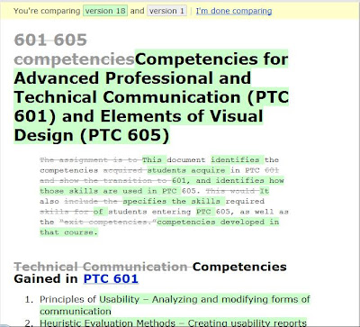
Having these older documents accessible and capable of being referenced at any point in the process was quite handy in illustrating the gradual evolution of the document and all the different permutations it took. There was also a function available that let you compare two different versions of the document and see the specific differences between them:


I found this tool to be quite useful, and I used it for three important functions. The first was to compare the newest version with the next most recent, to get a sense of what the latest changes were. The second function was to compare any two chronological documents in the series, to see the specific contributions that were made by any one person. And the final function was to compare the newest version and the original version to really get a sense of all the changes that were made since the beginning of the process.

The one complaint I did have about the software was that the comments on the bottom of the page were not displayed in order of the most recent, meaning that the first comment was always shown on top. This seemed counter-intuitive and also at odds with the software feature that correctly displayed the most recent version of the document on top.

I also happened to be directly involved in what I felt was one of the more successful instances of collaboration that occurred during the process. In one of my comments, I made an observation about the lack of parallelism in the two main sections of the document, and another member of the group acted on this suggestion to make the necessary changes. This really opened my eyes to the potential power of collaboration and teamwork. As someone who usually likes to work alone and have autonomy over his work, it was somewhat liberating to (1) communicate an idea and have somebody interpret it correctly, and (2) to not have to do the work myself!

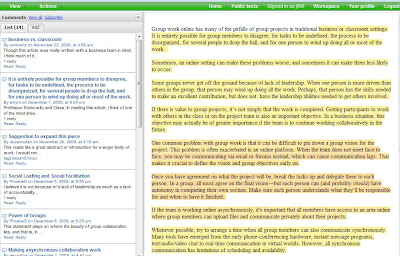
This same group and I also collaborated together to analyze a document using the website Co-ment.net. This experience was somewhat different than Writeboard because we were not actually creating content, but rather commenting on it. I found the software here to be rather effective and useful as well. To make a comment, you merely had to highlight the text, write something and then save it. All the text that was commented on stayed highlighted, and all the comments appeared on the left side of the page, in order of where the section of the document was that they were referring to. Clicking on a highlighted section displayed all the comment made about that section, and clicking on each comment also caused the highlighted text to be underlined, which I found pretty helpful:


However, one suggestion I would make about the software is that as you scroll through the source document, the "Comments" section should automatically scroll with you as well. That way, you won't need to scroll down through the entire "Comments" area to see the specific ones that pertained to the section of the document that you are viewing.

While the software on this site was pretty effective, this type of exercise seemed better suited for both a smaller group than we had and a larger document than we were working with. With so many people commenting, it became overwhelming at times, and by the end, most of the text was highlighted:


This seemed to almost defeat the purpose of the software--you couldn't really get a sense of the sections that were pointed out because they all were. It would have perhaps been more effective for the group to have set guidelines beforehand so that we would only focus on a specific idea or concept and not whole paragraphs of text. It also got a bit confusing because since there was so much overlap with the highlighted text, clicking on a section caused multiple comments to be displayed on the left:


All this seems to support the claim made here and here that smaller groups are usually better for collaboration, with the ideal number usually being three. While these articles refer more specifically to the process of creating a computer application, I'd imagine that this theory would extend to most types of collaborative work, as they seem to be similar in nature. For any type of collaboration, the key seems to be to make yourself open and willing to compromise. There is no way for something to turn out exactly the way you want it, but you must embrace the benefits and advantages afforded by collaboration, rather than harp on any of the potential drawbacks.

Thursday, December 3, 2009

Now You See It...Now You See Something Else

I first created this blog about 3 months ago, and at this point, it seems appropriate to look back and reflect on how it has evolved visually since that time. I initially chose a pretty simple template, since I felt that the emphasis of a blog should be on the actual text, and I did not want to distract or take away from this too much. I figured that I would get my feet wet with the whole blogging experience before I tried any visual enhancements. Here is what my blog looked like during its initial stages:


I am usually not too attracted to overly flashy or colorful visuals, so this minimalist design suited me as I slowly familiarized myself with the Blogger software and blogging as a whole. However, as I began to get more comfortable, I couldn't help but try my hand at a visual redesign of the blog. Below is the first redesign I made, which was nothing more than a simple change to the background and link colors:


It was pretty interesting to see how a simple and easy change of color scheme had a profound impact on the initial visual impression the blog. One thing I realized is that when changing the background color, you have to make sure the other color aspects on the page match the new color scheme. This might mean changing the link, title and text colors.

After making this first change, I decided to come up with a logo for the blog, which I did with this:


The background image is that of a music mixing board, which I found on the Internet. I changed it from a color image to black and white, increased the contrast, and then cropped it down considerably, all to hopefully have it fall under fair use. I chose this image since it went along with my blog's "music" and "sounding board" related theme. I then combined this with what I thought was a pretty "cool" looking font and uploaded the logo as an image file to replace the blog title, as seen here:


Eventually, I grew out of favor with the orange background, since it seemed a bit too heavy and had a "retro" feel that I wasn't really going for. I changed it to a nice shade of green that had a lighter hue and seemed to feel more current. It also brought out the text more and made the blog easier to read:


So as it is, I'm pretty content with the look of my blog right now, as it maintains a "minimalist" type feel with an emphasis on the words, but still has some visual stimulating elements to make it interesting and individually distinguished. There is, however, always room for further redesign, if nothing more than to break up the visual monotony and change things up now and again.