Thursday, December 3, 2009

Now You See It...Now You See Something Else

I first created this blog about 3 months ago, and at this point, it seems appropriate to look back and reflect on how it has evolved visually since that time. I initially chose a pretty simple template, since I felt that the emphasis of a blog should be on the actual text, and I did not want to distract or take away from this too much. I figured that I would get my feet wet with the whole blogging experience before I tried any visual enhancements. Here is what my blog looked like during its initial stages:


I am usually not too attracted to overly flashy or colorful visuals, so this minimalist design suited me as I slowly familiarized myself with the Blogger software and blogging as a whole. However, as I began to get more comfortable, I couldn't help but try my hand at a visual redesign of the blog. Below is the first redesign I made, which was nothing more than a simple change to the background and link colors:


It was pretty interesting to see how a simple and easy change of color scheme had a profound impact on the initial visual impression the blog. One thing I realized is that when changing the background color, you have to make sure the other color aspects on the page match the new color scheme. This might mean changing the link, title and text colors.

After making this first change, I decided to come up with a logo for the blog, which I did with this:


The background image is that of a music mixing board, which I found on the Internet. I changed it from a color image to black and white, increased the contrast, and then cropped it down considerably, all to hopefully have it fall under fair use. I chose this image since it went along with my blog's "music" and "sounding board" related theme. I then combined this with what I thought was a pretty "cool" looking font and uploaded the logo as an image file to replace the blog title, as seen here:


Eventually, I grew out of favor with the orange background, since it seemed a bit too heavy and had a "retro" feel that I wasn't really going for. I changed it to a nice shade of green that had a lighter hue and seemed to feel more current. It also brought out the text more and made the blog easier to read:


So as it is, I'm pretty content with the look of my blog right now, as it maintains a "minimalist" type feel with an emphasis on the words, but still has some visual stimulating elements to make it interesting and individually distinguished. There is, however, always room for further redesign, if nothing more than to break up the visual monotony and change things up now and again.

Monday, November 30, 2009

Is it Readable or Not?

Readability, as its name suggests, refers to the ease with which written text can be read by a specific audience. Readability formulas assign a numeric value to a given document, and this value identifies the reading level that the audience is expected to have. Among the various types of readability tests are the Flesch Reading Ease, the Gunning-Fog Index and the Flesch-Kincaid Reading Grade Level. All of these assessments utilize some type of mathematical formula that is based on the average number of words per sentence and the average number of syllables per word. Obviously, this is a very superficial way at looking at language, but it does have particular relevance in the field of usability.

A readability assessment of a given document can provide a pretty quick and effective way to determine its potential suitability for a specific audience. However, these assessments can really only determine if something is "not usable." If a readability test calculates that a document is beyond the reading level of the intended audience, then it would be safe to assume that the audience will have trouble getting through the text. It wouldn't matter if the other elements of the document are appropriate for the audience; if the audience can't read it, then it's not usable!

However, if a readability assessment determines that the reading level of the document is within the range of the reading level of the intended audience, it would not be safe to assume that the document is totally usable. This is because there are so many other factors that readability formulas can't take into consideration, such as the document layout, the complexity of the concepts, the audience's interest and knowledge of the material, potential gender or racial biases, and so on. If something is unusable in one area, then it is generally unusable as a whole; thus, one cannot only use a readability assessment to determine a document's usability.

What this means is that readability assessments don't really have much bearing or relevance beyond what they have specifically been designed to measure--that is, the readability of the text. They would not be very effective in assessing the visual design elements of a document. This is because design elements are generally subjective and much harder to define; as such, they cannot be mathematically quantified the same way readability elements are. Nor does the readability of a document imply anything about the actual quality of the writing. Just because a document is potentially readable doesn't mean it is any good or even worth reading in the first place. While readability assessments do have a role to play in the field of usability testing, it is a very specific role; attempts to make use of them beyond this could potentially yield unreliable results.

Wednesday, November 4, 2009

My Kind of Website

As discussed in a previous post, the design of a website should be heavily influenced by the intended audience of that site. I recently got a chance to put this theory into practice when I used Google Sites to create the website How To License Music. The intent of this site was to teach and inform about the process of licensing a piece of music for a visual project, and it was designed with a specific audience in mind--myself. That is, someone with a learning style similar to my own.

After taking this Index of Learning Styles Questionnaire, it was revealed that I was a highly Reflective and Global learner and a moderately high Intuitive and Verbal learner. Using these descriptions of the different learning styles as a guiding tool, I went about designing my website so that it would best be utilized by an audience with these particular learning styles.

In general, my website is designed to present information in a broad, conceptual manner. This is partially achieved by having the key important terms stand out, which are first seen on the page as bolded text, as such:


When these terms are "moused over," more information and an additional description is revealed. This is illustrated below, showing how the page looks when the cursor hovers over the the bolded term "Music Library" at the bottom of the page:

Bolding the text in this way causes it to stand out, which highlights these important concepts at a glance. This way of presenting information is conducive to the global learner, who prefers to see the larger, more important concepts first, as opposed to the tiny details. The ability to see the terms first and then find out more information about them will help the reflective learner, who learns best by taking things slowly and having time to digest and "reflect" on the information.

In addition, there is a separate "Important Terms" page that collects all of the bolded terms used throughout the site and presents them in a dictionary-like format. This uses language to enhance the visual aspects of the page, which aids the verbal learner:


In keeping with this theme, a universal aspect of the website's design is that all of the navigational icons are enhanced with text, as seen here:


And here, with the illustrations of various movie scenes having captions underneath:


Site navigation is also presented in outline format with clickable text, as opposed to images or icons. In terms of the background and color scheme, pale yellows and grays give the page a muted look, causing the text to stand out as hierarchically dominant. All of this plays to the strengths of the verbal learner, who generally prefer words to images. This does not mean that there is no use for visuals; rather, the optimum learning experience is to strike the right balance between both verbal and visual information. This is the point in having all the images enhanced with additional text.

I also employed design features that were helpful to the other ends of the learning spectrum. Attachments of actual licensing contracts give practical examples of the issues discussed, which encourages the "sensing" learner who prefers to see connections to the real world. In addition, pages are presented in a logical, sequenced order, which helps the "sequential" learner. Employing these design features helps to broaden the reach of the website and also challenges the other types of learner to overcome their limitations.

As this was my first foray into web design, it was quite useful to have this background knowledge on how to use design elements so that they are geared towards a certain audience. This helped me develop a focused site that should specifically appeal to learners like myself but also be accessible to a general audience.

Wednesday, October 28, 2009

Judging an Album by its Cover

Images have always had an important role to play in communication; perhaps even more so now with the rise of the Internet and all of its visual possibilities. When used effectively, images can create a meaning beyond what simple words can express. In the online world, images can also serve a functional role in aiding with navigation and maintaining the "authenticity" of the online experience with the real-world one. One interesting example of this is the use of album covers in music websites and online stores.

An album cover is a representational illustration that was logically packaged with a record or CD to enhance the overall artistic product. These images helped to create an iconography for what was otherwise a strictly aural experience, and they also defined and set apart each album in a visual sense. However, with the advent of the MP3 and digital downloading, album covers were no longer needed in the same way. One can buy and listen to an album without ever needing to know what the CD cover looks like, yet digital album covers are still frequently used in the online music marketplace.

Within digital stores such as iTunes, album covers can function as icons in helping with navigation. Taking a look at the screenshot below, we can see the album covers dominate the storefront:


By clicking on each cover, we are taken to the corresponding page where that album can be actually purchased, as seen here after clicking on one of the images:


By using the album cover as the means for online navigation and purchasing, the online music buying experience is linked to the real world, recreating the feeling of being in a physical record store and rummaging through the CD's and glancing at the different covers.

This use of album covers as icons for navigation can also be seen in music review websites such as Pitchfork, as seen below on a section of their homepage:


Each cover is a corresponding link to a review for that album or track. However, unless the title and band name are actually included within the image, you must scroll over the album cover to see this information. As seen below, when the album on the far right is scrolled over, the artist and album name are displayed along with the corresponding review score:


This does not seem to add much in terms of ease of navigation, as it would be easier to see the artist and album name by just listing it as text without the corresponding image. However, by using the album cover, Pitchfork is maintaining the visual traditions of the art being packaged with the music to create one unified product. This can also be seen in their individual album review pages, which all prominently display the album cover, as seen here:


This last online use of album covers fulfills their traditional role as representational illustrations that create a visual iconography to be associated with the music. By keeping with this tradition, Pitchfork and other music websites are maintaining the richness and credibility of music consumption by making the online experience similar to the real world one.

Wednesday, October 21, 2009

Bookmarking the Web

It is easy to get overwhelmed by the massive amount of information that is available on the Internet. On virtually any topic, there are a multitude of websites, articles, blogs and wikis out there just waiting to be found and pored over. However, the task of sifting through cyberspace to find the information that is truly relevant and useful to you can be frustrating and time-consuming. Hours can be wasted on unnecessary tangents and dead-ends. This is where "social bookmarking" sites such as Delicious and Digg come into play.

Social bookmarking refers to the act of "bookmarking" links to websites and articles and then sharing that list with the online community. These links can also be "tagged" with descriptive terms that allow the article to be searched for at a later time. This whole process is sometimes referred to as "folksonomy," a taxonomic classification system created from the "ground up" by the end users. As more people link to and tag a certain article or website, the higher up in the ranking it goes and the more likely it is someone else will see it. This works as a natural "peer review" by weeding out the less popular content and ensuring that the articles the most people actually want to read will remain the most visible.

There is another side to this coin though. By putting the power in the hands of the general masses, we are trusting much to the "wisdom of the crowds." Mass popularity, however, is not always an indication of high quality or of interesting content. The most popular movies, music, and books are usually not the ones that are the most critically acclaimed and prone to further analysis and study. The process of peer reviewing and determining what content to publish has traditionally been done by a small, select group of professionals, as opposed to the general public. This brings us to the question as to whether social bookmarking is really a "democratic taxonomy that allows the community to peer review the content of the Web," or if it's just "a disorganized collection of personal preferences." My take on it is that it can be both, depending on the context.

Chances are that a person taken at random will have different interests than myself, so their list of favorite websites and articles might not interest me very much. However, because the online community is such a vast and broad group of people, patterns begin to emerge on a large scale. By playing with such large numbers, we can ensure that there will be at least some validity to the shared content. Sub-sets of smaller communities branch out from the overall online community, and the key is to find these communities of like-minded people. By utilizing the "tagging" system and searching for relevant keywords, you can cut right to the topics that interest you and bypass all the extraneous content.

A logical extension of this is the potential use of social bookmarking in the clearly-defined worlds of academia and the professional workplace. By nature, these groups have common interests and benefit from the collective sharing of information. Social bookmarking allows them to organize and break down the information on the Internet into relevant "micro-content" that pertains to their particular area of study or work. This can be a very effective way to organize the massive amount of content on the Internet to make it more easily searchable and manageable.

As an example of this, I have tagged 6 articles in my account at Delicious that are relevant to my fellow students in the graduate program for Technical Communication at NJIT. The articles cover recent topics of study, including web design, typography, usability and digital copyright. Because we use a unique code that only the other students and professor will know, we are able to create our own separate community within the broader Web. This allows us to zero in only on the information that pertains to our studies and is a great way to enhance the collective learning experience.

The ability to manipulate and organize the information on the Internet to make it more personalized and relevant is a necessity, given the size and scope of the Web. Social bookmarking fulfills this need, and as such, is an important tool of the Web 2.0 era. While there are concerns as to giving too much sway to the whims of popular sentiment, this still remains the most effective way of organizing the vastness of information that is the World Wide Web. As it is, the process of peer reviewing would be too massive an undertaking to be done by a select group of professionals. This provides further proof of the Internet as the ultimate "democratic" communication tool, for better or worse.


Tuesday, October 13, 2009

Web 2.0 - Powered by Collective Intelligence

Web 2.0 is one of those buzzwords that is tossed around a lot but rarely defined, almost as if you're expected to intuitively know what it means without needing a formal explanation. Yet, it probably means a lot of things to a lot of different people, and it has no doubt changed some of its meaning along the way.

From a broad conceptual standpoint, I look at the beginning of the Web 2.0 era as when the Internet became "self-aware" and started to take advantage of its unique characteristics as a medium unlike anything before. The key focus became not in finding new ways to "create" content but rather new ways to "consume" content. This manifested itself through an emphasis on website interactivity and user contributions. An important realization was that the Internet's greatest asset was not the new communication tools it introduced, but rather the fact that the average person now had access to these same communication tools that had normally been reserved for a select few media professionals. Websites like YouTube, Facebook and Wikipedia, which rely heavily on user-generated content, established themselves as relevant social forces. Social networking took off, and people began to create an entirely new "online" persona for themselves that seemed to exist independently from their actual self. Basically, Web 2.0 replaced passive participation of online content with active participation.

In his prescient blog on the issue, Tim O'Reilly mapped out what he saw as 8 defining characteristics of Web 2.0. One of the characteristics he mentions is "Harnessing Collective Intelligence." As he explained, "Hyperlinking is the foundation of the web. As users add new content, and new sites, it is bound in to the structure of the web by other users discovering the content and linking to it." Taking a look at the site Metacritic.com, we can see this aspect of Web 2.0 in action.

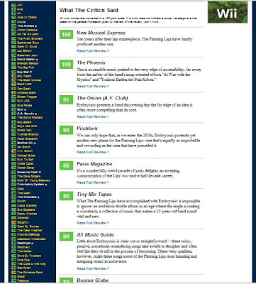
Metacritic is a collection of critical reviews about various forms of entertainment media, such as movies, music, TV and videogames. The site provides direct links to the original reviews and also formulates a "Metascore" based on the average review. This Metascore is a great way for the user to instantly get a sense of the general critical consensus, without having to search for all the information themselves. This is illustrated in this page for a new album by the band The Flaming Lips:


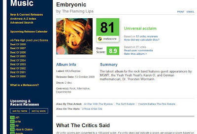
As you can see, the Metascore is prominently displayed, with a corresponding description of "Universal Acclaim" to further summarize the information and make it easily digestible for the user. All of the relevant album information is listed, along with a short summary. For those who want to read the actual reviews themselves, a short excerpt is provided on the page with a link to the full article:


Along with these formal reviews, there is also room for audience input and interaction. A separate User Score is listed underneath the Metascore, and user-submitted reviews are displayed along the sides and bottom of the website. There is also an area for discussion forums on the separate entertainment topics. Here we see an example of the User Reviews displayed on the right alongside the other, more formal content:


This audience participation and user-submitted content is a key feature of Web 2.0 and reflects the sense of the Web as an online community and social portal. According to Daniel Nations of About.com, "Metacritic has all you want in Web 2.0 site with both user reviews and expert reviews from around the web."

Like many Web 2.0 websites, Metacritic doesn't actually create its own content but rather organizes and presents it in a simple, user-friendly fashion. It builds upon the infrastructure of information that was available in the old media days and provides a service that is unique to the Internet age. As stated by Metacritic co-founder Marc Doyle in this interview:

"Before the rise of the world wide web, consumers were at the mercy of their local critics for advice about which movies to see, what games to buy, etc. Furthermore, the influence of advertising campaigns and the emphasis on fawning quotations from obscure critics that nobody had ever heard of in newspaper/magazine ads was huge. Bad movies and games could be thrust on consumers without a great deal of education to rebut the messages from PR companies or the potential biases of individual critics. Metacritic's mission is to bring together the most professional, skilled and respected critics in each section of our site (movies, games, music, and TV) to provide our users with the most reliable indicators of quality upon which they can base their purchasing decisions. Again, this type of service would not have been possible before the web was developed." (Emphasis added)

This quote perfectly articulates one of the key aspects of Web 2.0--the opening of and democratization of media, so that it is no longer only in the hands of a select few. This is an extraordinarily powerful development that has had a profound effect on our culture and society. Metacritic serves as a great example of this collective sharing of information and intelligence that has permeated the Web 2.0 era.

It is also interesting to note that there is growing talk of a Web 3.0 and speculation as to what that might entail. However, as O'Reilly points out, Web 2.0 came about as a result of the dot-com bust, so for there to be a Web 3.0 there would need to be a "serious discontinuity from the previous generation of technology." Even so, some of the ideas as to what Web 3.0 will be include "web without browser" and "the breaking of the screen/keyboard paradigm." These are certainly interesting and exciting concepts, but no matter what the next generation of the Web experience turns out to be, it will no doubt be heavily powered by the collective force of the end user.

Wednesday, October 7, 2009

History of the MP3

If you have about 20 minutes to kill, I highly recommend checking out this utterly fascinating article from Pitchfork magazine on the social history of the MP3. Beyond just chronicling the rise of this new music format, the article gives a broad overview on how advances in technology can work to change and shape culture in powerful and sometimes unforeseen ways. I was amazed by the breadth and depth of the piece and how meticulously it was researched. It almost functions as an argument for itself--it is exactly this type of well thought-out and intelligent "criticism" that the author is advocating for in this new world of global music sharing and online communities. I am continually amazed by the individual writing on Pitchfork, and this speaks to the growing reality that web-based media is capable of creating content just as good as that from reputable newspapers, magazines and other print media.