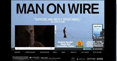
"Kung Fu Panda," an animated feature with talking animal characters, is clearly a movie marketed to kids and families. "Man on Wire," a thoughtful documentary about a tightrope walker that walked between the Twin Towers, has a much more serious subject matter and is undoubtedly aimed at an older crowd. The difference in intended audience is clear from a simple cursory glance of each website's home page:


The simple black-dominated color scheme for the "Man on Wire" website conveys a weighty and serious tone, while the eye-grabbing orange and yellow of the "Kung-Fu Panda" site is light and cartoonish. The font text for "Man on Wire" is small and completely ordinary, while for "Kung-Fu Panda," it's large and colorful. While both contain advertisements for the DVD, they do so in a very different manner. The advertisement for the "Man on Wire" DVD is small, simple and to the point. In the larger context of the website, it almost blends into the background. The "Kung-Fu Panda" DVD advertisment seems as if it's jumping out of the page. It's fairly large and filled with exclamation points and other attention-grabbing elements. All of this can be seen by comparing the two separate images:


To further explore this point, the website for "Kung-Fu Panda" is really intended as an interactive user experience. To actually enter the site, you have to first watch an action-packed intro that introduces the main characters of the movie and further advertises the DVD. When you get to the main page, the screen moves around almost as if you're playing a video game, and you can click on the different characters to get more info, see a gallery, or download wallpaper, screensavers and other visual content. Music and sound effects are played as you navigate around, and the whole experience is visually stimulating to the end user. The website enhances the movie itself and is an entirely new entertainment product in its own right; it adds to the story and to the internal mythology of the characters. Looking at the screenshot below shows the kind of supplemental storytelling employed:

Analyzing the intended audience of this website reveals just how technologically adept today's youth are. To navigate the site effectively, it is necessary that the user have fairly advanced computer and internet navigation skills. Clearly, the designers assumed their young audience would have these skills. In addition, the website contains a tremendous amount of information for the audience to absorb and process. This kind of information overload is commonplace among this generation of kids that have grown up in the Information Age and are used to having the boundless knowledge of the Internet at their fingertips.
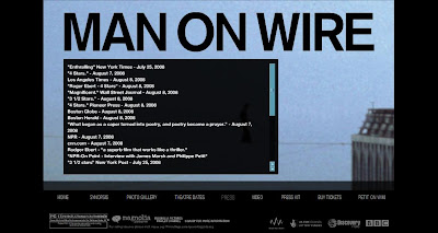
In contrast, the website for "Man on Wire" is intended for an entirely different audience and is designed accordingly. As opposed to being an active, entertaining learning experience, the website is fairly passive. Its main goal is to simply provide the audience with relevant information about the movie. There is a link to the Wikipedia page of Philippe Petit, the man whom the documentary is about. An unobtrusive trailer is embedded on the home page, with quotes from critical reviews slowly alternating over the top. There is even a separate tab for a list of other quotes about the movie:

Clearly, the designers of the site realize that this information is what would most interest the audience and make them likely to see the movie. These external movie reviews are noticeably absent from the "Kung-Fu Panda" website, as the designers assumed that the younger audience would probably not care about this type of information.
Along with the simple, black color scheme, a bluish tint gives the "Man on Wire" website a feeling of being dated, which is appropriate given the movie's use of original videotape from the events depicted. As opposed to the over-the-top qualities of "Kung Fu Panda," the website has a very natural and real feel, and there is no external music or sound effects. It focuses on the movie itself and communicates mostly through verbal means, using simple, text-based information. In general, it attempts to provide substantial information to its more sophisticated audience and do so unobtrusively. In contrast, the "Kung-Fu Panda" website is dominated by visual forms of communication and employs the use of stimulating colors and images. Its goals is to hold the attention of its young audience and to enhance the experience of watching the original movie.
By analyzing these two websites, we were able to see how a difference in intended audiences can result in a difference in web designs. Both sites seem to take their audience into consideration and are able to communicate and connect with their audience using the appropriate tools and information. This is no doubt an important skill to master if one hopes to use the Internet as an effective communication tool.

No comments:
Post a Comment