Wednesday, September 30, 2009

Calibri: The New Default

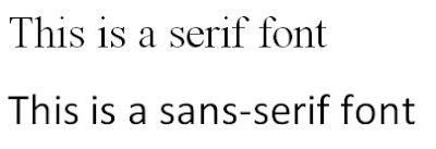
Those of you using Microsoft Office 2007 may have noticed there is a different default font than you were probably used to. Taking the reins from Times New Roman and Arial, Calibri has become Microsoft's new "go-to" font. Calibri is a sans-serif font, meaning it lacks "feet" (the short cross lines at the end of main strokes). This differs from serif fonts such as Times New Roman, which have these "feet":


Typically, serif fonts are considered better than sans-serif fonts for reading long lines of text, making Microsoft's choice of Calibri all the more interesting, particularly when it comes to word processing. Perhaps the reason for this is that sans serif fonts are also considered better for on-screen reading. This would be yet another indication of how technology is changing the tools we use to communicate; clearly, Microsoft realizes that the majority of reading is now done on the computer as opposed to in print.

Being that Calibri will become a ubiquitous font now that it's the default font for Microsoft Office, it is particularly appropriate to conduct an analysis of this typeface. In Kathleen Yoshida's article Avoiding Typeface Terrors, she points out three general characteristics of typefaces that are useful to consider. One is legibility, which refers to the ease of which the reader can identify the individual letters. She outlines a simple test to measure this, which is illustrated below:


In real life, this would be comparable to placing a piece of paper over the bottom half of the letters. As you can see, the words are still pretty readable; however, there could be some confusion with the "y," "n" and "b" being mistaken for a "v," "p" and "h" respectively. Overall, though, Calibri is an adequately legible font.

The second aspect of typefaces mentioned by Yoshida is readability. Readability differs from legibility in that it is a broader consideration; it focuses on how easily a line of text can be read. This depends on many factors, one of which is x-height. X-height refers to the distance between the baseline to the top of the letter; basically, everything above the descenders and below the ascenders. It turns out that Calibri has a fairly small x-height when compared to other common sans-serif fonts. Below is a comparison of Calibri next to Arial next to Verdana, all at 72 point size:

Calibri is obviously smaller than the other two fonts, and this has an effect on another aspect of readability--white space. Because Calibri has a small x-height, the space between separate lines of text is larger than with fonts with larger x-heights. This can result in too much white space, which reduces readability. Thus, when using Calibri, the space between lines of text (or leading) should be reduced.

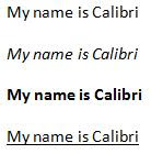
Another factor that influences readability are variations such as italics, bold and underline. According to Ann Van Wagener in The Next Big Thing in Online Type, "Calibri set in regular, bold, or italic is a pleasure to read." As seen below, the typeface variations for Calibri are straightforward and readable:

Personality is the last feature mentioned by Yoshida, and this one is much more subjective than the other two. The main features that distinguish a typeface's personality are the presence or absence of serifs and its stroke weight. Calibri has a fairly light stroke weight, which makes it pleasant to read. According to Van Wagener, Calibri has a very "warm" and "friendly" personality. She attributes this to the "soft rounded corners," which create a "smooth reading experience." Another unique characteristic of Calibri is that it is considered suitable for both smaller, body text sizes as well as larger headline sizes. This versatility is perhaps another reason why Microsoft chose it as the new default font for its latest Office suite of programs.

Wednesday, September 23, 2009

Tightrope Walkers and Talking Pandas: An Analysis of Website Audiences

Knowing your audience is a crucial part of any type of communication, including web design. As the Internet is used by virtually everyone, websites can be geared towards a whole variety of audience groups. If they're effectively designed, websites with widely different intended audiences should look and feel different from each other. Official movie websites can be particularly effective in illustrating this point because the intended audience is clear--it is the same as the audience for the movie itself. Let's examine the websites for the 2008 Academy Award-winning documentary "Man on Wire" and the 2008 Academy Award-nominated animated kid's feature "Kung Fu Panda."

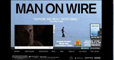
"Kung Fu Panda," an animated feature with talking animal characters, is clearly a movie marketed to kids and families. "Man on Wire," a thoughtful documentary about a tightrope walker that walked between the Twin Towers, has a much more serious subject matter and is undoubtedly aimed at an older crowd. The difference in intended audience is clear from a simple cursory glance of each website's home page:


The simple black-dominated color scheme for the "Man on Wire" website conveys a weighty and serious tone, while the eye-grabbing orange and yellow of the "Kung-Fu Panda" site is light and cartoonish. The font text for "Man on Wire" is small and completely ordinary, while for "Kung-Fu Panda," it's large and colorful. While both contain advertisements for the DVD, they do so in a very different manner. The advertisement for the "Man on Wire" DVD is small, simple and to the point. In the larger context of the website, it almost blends into the background. The "Kung-Fu Panda" DVD advertisment seems as if it's jumping out of the page. It's fairly large and filled with exclamation points and other attention-grabbing elements. All of this can be seen by comparing the two separate images:


To further explore this point, the website for "Kung-Fu Panda" is really intended as an interactive user experience. To actually enter the site, you have to first watch an action-packed intro that introduces the main characters of the movie and further advertises the DVD. When you get to the main page, the screen moves around almost as if you're playing a video game, and you can click on the different characters to get more info, see a gallery, or download wallpaper, screensavers and other visual content. Music and sound effects are played as you navigate around, and the whole experience is visually stimulating to the end user. The website enhances the movie itself and is an entirely new entertainment product in its own right; it adds to the story and to the internal mythology of the characters. Looking at the screenshot below shows the kind of supplemental storytelling employed:


Analyzing the intended audience of this website reveals just how technologically adept today's youth are. To navigate the site effectively, it is necessary that the user have fairly advanced computer and internet navigation skills. Clearly, the designers assumed their young audience would have these skills. In addition, the website contains a tremendous amount of information for the audience to absorb and process. This kind of information overload is commonplace among this generation of kids that have grown up in the Information Age and are used to having the boundless knowledge of the Internet at their fingertips.

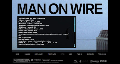
In contrast, the website for "Man on Wire" is intended for an entirely different audience and is designed accordingly. As opposed to being an active, entertaining learning experience, the website is fairly passive. Its main goal is to simply provide the audience with relevant information about the movie. There is a link to the Wikipedia page of Philippe Petit, the man whom the documentary is about. An unobtrusive trailer is embedded on the home page, with quotes from critical reviews slowly alternating over the top. There is even a separate tab for a list of other quotes about the movie:


Clearly, the designers of the site realize that this information is what would most interest the audience and make them likely to see the movie. These external movie reviews are noticeably absent from the "Kung-Fu Panda" website, as the designers assumed that the younger audience would probably not care about this type of information.

Along with the simple, black color scheme, a bluish tint gives the "Man on Wire" website a feeling of being dated, which is appropriate given the movie's use of original videotape from the events depicted. As opposed to the over-the-top qualities of "Kung Fu Panda," the website has a very natural and real feel, and there is no external music or sound effects. It focuses on the movie itself and communicates mostly through verbal means, using simple, text-based information. In general, it attempts to provide substantial information to its more sophisticated audience and do so unobtrusively. In contrast, the "Kung-Fu Panda" website is dominated by visual forms of communication and employs the use of stimulating colors and images. Its goals is to hold the attention of its young audience and to enhance the experience of watching the original movie.

By analyzing these two websites, we were able to see how a difference in intended audiences can result in a difference in web designs. Both sites seem to take their audience into consideration and are able to communicate and connect with their audience using the appropriate tools and information. This is no doubt an important skill to master if one hopes to use the Internet as an effective communication tool.

Tuesday, September 15, 2009

Being and Nothingness

In today's globally connected world, visual communication is an extremely important tool, as it can cut across language barriers and convey universally understood messages. To be an effective visual communicator, one must be able to identify and understand some of the commonly used elements of visual design. I recently came across this video that, in communicating its message, effectively utilizes a lot of these elements:


The video itself seems simple enough. At first, we are presented with a still, female body standing completing erect. Parts of her outline are incomplete, yet the form is still implied. There is not much depth, but a light shading gives the form some volume. As the video plays, black text begins to stream out of her mouth and cover up her body. We hear a "buzzing" of human voices attempting to pronounce the letters of the text, resulting in an unintelligible and disconcerting mumble. Eventually, the black text completely envelopes the woman's body, and beneath her feet, the text spells out an expression in French:


"L'etre Et Le Neant", which translates to "Being and Nothingness," serves as the title to a classic essay by Jean-Paul Sartre. A little research on Wikipedia reveals that, in the essay, Sartre attempts to define consciousness as an "act of negation" and a "transcendence of the given world." Looking back at the video, it becomes apparent that many of the visual elements serve to illuminate and enhance Sartre's thought-provoking concept.

The main visual theme employed in the video is that of creating tension through contrasting elements. The simple black and white color scheme conveys the sense of two opposing forces. The outline of the body is a thin, quivering line, yet the black text becomes a solid fill. The body is symmetrical and organic, yet the text is geometrically shaped and moves in an asymmetrical pattern. The shape of the figure remains flat and without much depth, yet it remains fixed in the foreground because of the volume created from the shading and from the slight quivering of the outline. There is also a interesting dynamic created in the overall use of space, with the "positive" object being surrounded by the "negative" empty space. All of these tension-filled elements seem to fit in with Sartre's theme of "the impotence of physical causality over human beings."

The visual dominance of the black text is shown in a literal sense by its complete enveloping of the body. However, what's interesting is that it's not entirely clear as to whether or not the body is becoming something or nothing. Is the black text negating the body, or is it merely turning it into a different form of being? These questions all relate to Sartre's theme of the relationship between physical reality and the human consciousness.

One of the most captivating features of the video is the rhythm created between the vibrating body, the moving text, and the buzzing sound of the human voices. This forces our eyes to follow the stream of text as it pours out of the mouth into the body, and the repetition of the pattern holds our attention throughout. The mumbling voices create and maintain a constant tension, which is eventually released at the end when we hear a man with a very deep voice say "L'etre Et Le Neant," along with it being spelled out by the text. This serves as a pronouncement, as if what we just saw was an actual visual representation of the dynamic between "Being" and "Nothingness."

Though it first appeared to be pretty straightforward, upon further analysis, the video revealed itself to have enormous depth in both form and content. It was particularly amazing how it was able to use some rather simple visual elements in expanding and building upon a rather complex idea. This really illustrates the power of visual design as a communication tool, a tool which becomes ever more useful in this increasingly image-dominated society.

Wednesday, September 9, 2009

Corporate blogging in the music industry

While I'm pretty new to this whole blogging thing, apparently so is the music industry. Or more specifically, major record labels. I was a bit surprised to come across this article from Wired Magazine to find out that only one major label has an official corporate blog. That would be EMI Australia, which recently launched the blog The In Sound From Way Out earlier this year, becoming the first major label to do so.

While it's a step in the right direction, it certainly speaks volumes to the slowness of the industry in adapting to and utilizing new technologies in general. It does, however, gives EMI a giant head start in the field. As they state in the About section, they are "the only major label with this level of openness about who we are and what we do." This will no doubt help them differentiate themselves from their major label brethren and perhaps project a more positive and "hip" corporate image. They go on to state, "We hope you respond to that with openness of your own." While it's refreshing to see that level of candor displayed, it certainly underlines their intention of using the blog as a marketing tool in which they can interact with fans and attempt to sell and market their catalog.

The most notable and striking thing about The In Sound From Way Out is definitely the use of visual elements. From the layout, to the color scheme to the abundance of pictures and videos, it's clear that the blog is intended to function as a user-oriented interactive experience. The end goal seems to be to promote the EMI brand and catalog. It emits a surprisingly informal tone that contributes to the desire of projecting a more open and inviting corporate image, rather than being thought of as stuffy and uptight as most major labels are.

In terms of the blog entries themselves, all of them contain visual content such as pictures and embedded videos or have links for the user to stream or download MP3s. Because of the abundance of peripheral content, the entries seem to vary quite a bit in length. The actual text is usually only a few lines or so, though some can be a few paragraphs. The frequency of posts is a bit puzzling, as there only seems to be a few each month and they all seem to fall around the same time. The blog clearly encourages audience interaction by having a comments box and "share" tool at the end of each post, though only a handful of entries actually had reader comments.

While The In Sound From Way Out (or TISFWO as I like to call it) is the one and only blog run by a major label, it seems that just about ever indie record label out there employs this communication tool. This certainly makes sense, as indies have traditionally been ahead of the majors in terms of openness and innovation. One indie blog I found to be particularly interesting was the Matablog by Matador Records, one of the biggest and most successful indie labels.

The Matablog takes on a much more personal and conversational tone than TISFWO, and some of the bloggers seem to speak directly to the readers as they would to a regular friend. They frequently use the first person "I" when writing, as if speaking only for themselves, while the bloggers on TISFWO almost always used "we," as if representing the company as a whole. This definitely illustrates the difference between the bottom line, business-oriented mentality of the majors and the more independent and maverick nature of the indies.

As with TISFWO, the Matablog seems to be intended for the fans and consumers of Matador Records, however, they employ less clear cut marketing and sales efforts. The intent of most of the posts seems to be more informational than anything else; a lot of them are simply updates about current show and touring information. The entries are also a bit longer, usually a few paragraphs, and are posted much more frequently.

This is not to say that the Matablog is not used as a marketing tool as well, as there are still plenty of links to MP3s and ways to order and pay for music. Visually, it's not quite as busy as TISFWO, though it still has a lot of going on; there are a ton of pictures and a some embedded videos too. As with TISFWO, comments and reader participation is encouraged, with a link at the end of each post. Overall, the feel of the blog seems to project the image and aesthetic you might expect from an indie label: laid back, honest, and not necessarily obsessed with selling their product down your throat.

Clearly, blogging is an important communication tool that can be utilized productively in the corporate world. It offers a new outlet for companies to interact directly with their consumers and to further market their products. While the independent entities of the music industry seem to have embraced this new technology, the major label behemoths seem much less interested in creating a blogging experience for their consumer base. Hopefully, they'll soon follow EMI's lead and not underestimate this technology the same way they underestimated the rise of the Internet and the transformative effect it would have on their industry.

Saturday, September 5, 2009

Mission Statement

The internet has fundamentally changed the way we communicate. From email, to instant messaging, to blogs, our world is becoming more and more interconnected, and information flows fast and freely. It can be overwhelming at times. The future will belong to those that can master these communication tools and synthesize this information into coherent and meaningful ideas. While the democratization and "opening" of media is a fundamentally great thing, the need for quality remains as strong as ever. This blog will attempt to explore and monitor modern communication tools, while keeping an eye towards the role of the "professional" technical communicator in creating and maintaining a high standard of content.

When appropriate, consideration will be given towards the role of music in this ever-changing world. Perhaps no industry has been as affected by the rise of the internet and received as much publicity and attention (mostly negative) as that of the music industry. From the advent of the MP3, to digital streaming and downloading, technology has forced the business of selling music to re-invent itself and evolve more rapidly than anyone could have foreseen. This is not necessarily a bad thing, as it has forced progress and change on an business model that was growing stale and a little too content with the status quo. As one of the most ubiquitous and universal forms of communication, music should evolve with society and technology. This forum will hopefully function as a "sounding board" for ideas and issues pertaining to new forms of "technical" communication, including how new technologies might affect the function of music in the digital age.